In line with their new film to come out this autumn, Rise of the Apes (prequel to Planet of the Apes), 20th Century Fox released a brief which asked designers to promote the upcoming movie. My short teaser animations could be sent around the web, shown on websites or on television, and centre around the idea of 'warning' the public via public service announcements that 'The Apes are Coming'. However the animations are in a way quite lighthearted, as whilst using warning signs, and trying to show an element of panic, they reference to the usual things we see monkeys doing - such as jumping on our cars at a safari park, the ape in the Donkey Kong game, or even references to King Kong. Unfortunately I never entered my work, as I still wanted to make some changes after feedback which was then too late for the deadline.
Here are the animations storyboarded...
Wednesday, 18 May 2011
Tuesday, 17 May 2011
FLUX magazine project
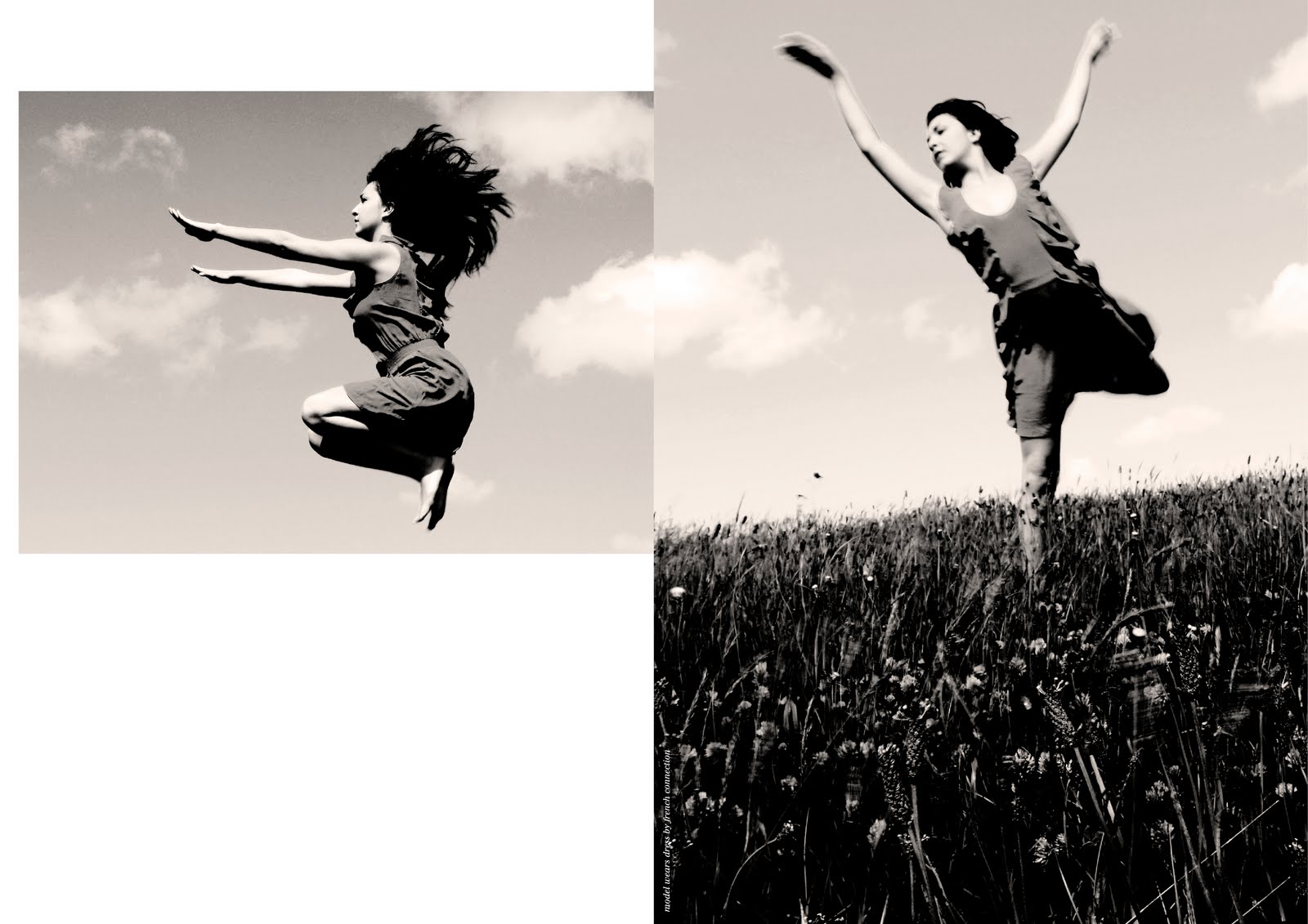
We were given a few of the features for the upcoming Flux magazine to experiment with for magazine spreads. For once, I wanted to try be a bit more hands on for this project - it's been a while since I've got off the computer! So I tried out some things with creating my own type, and type within images. I'm not going to lie, I still used the computer for some bits, but at least the aesthetic is a bit of a change for me! I'm also going to try and get into photography a bit more, so I tried a couple of fashion shoots - one just a fashion editorial, and another a Pina Bausch inspired dance/fashion shoot. I think there's still a lot that could be worked on - wish I'd given myself more time too, but I enjoyed the change and the challenge, and think some of my pieces give interesting results!
Fashion Designer ANN DEMEULEMEESTER
Pina Inspired shoot.
Fashion Designer ANN DEMEULEMEESTER
Composer PHILIP GLASS
Film Director FEDERICO FELLINI
Choreographer PINA BAUSCH - Here, the mud letters are based on her dance piece, Rite of Spring, performed on a stage covered in dirt.
Pina Inspired shoot.
Fashion Editorial
Identity Workshop - 'Fresh' Sandwich Shop
In this workshop I was given the task of creating an identity for Laura Jackson's fantasy company - a sandwich shop named 'Fresh'. The main theme of stripes - suggesting layers in a sandwich - which can be seen on the knife in the logo, is continued in promotional items, such as give out post it note stacks that say 'Don't forget to eat at fresh', or stackable napkins, and use of stripy knives instore.
Me in the prospectus
I've recently received this photo from my university, which is to be used in our undergraduate prospectus! Last August I undertook a placement at Cube 3 Marketing in Bolton, who are now situated in Manchester. And so a while back uni came to take a photo and ask me about my time there.
My placement was also featured on Creative Boom Magazine's blog here.
I would love to go back there this summer too so fingers crossed!
My placement was also featured on Creative Boom Magazine's blog here.
I would love to go back there this summer too so fingers crossed!
Ian Anderson Workshop
The two Ian Anderson workshops of this term have been great experiences - extremely challenging and exhausting but totally worthwhile, and full of learning experiences, in particular presentation skills.
In the first workshop we had a few hours to create a self portrait of ourselves as a designer, and then the following day had to create a logo for the person next to us taking influence from their self portrait, and then present this to the group. Emma had chosen Francium, due to its reactive properties, conveying how she reacts well to new people and experiences. My identity is primarily for use as an online website home page, the idea being that as someone rolls over it, the logo would 'react'. The 'bonds' would break and reform, flickering through different positions, and the word creative also reforms to spell out reactive. Here I have storyboarded it as an idea, (left column) and also created business cards for Emma.
Renaming Ian Anderson
A while back, designer Ian Anderson (Designers Republic) set us a brief to rename him, and create an A1 poster explaining why. He then picked some of us to participate in a workshop which I was lucky enough to be chosen for! During my research on him, I found there were a lot more google results for lead flute player of Jethro Tull, also named Ian Anderson, as well as a few others with the same name. As Ian Anderson's design work stands out so much, I decided that his name should not result in any of these 'mix ups' and decided to announce a 'big name mix up' where the letters of Ian's named were mixed up to form his new name. And I was also hoping he would find my modified image of him playing the flute instead of Jethro Tull rather amusing!
Back to blogging
We've all been so busy getting our work completed for assessment that it's been a while since I've posted any work! So thought I'd get my blog back up to date.. watch out for lots of posts to come..
Thursday, 7 April 2011
Travel Book Covers
In a recent book cover project I chose to design some new covers for a travel guide. Inspired by some of my past family holidays, and trying to squeeze absolutely everything about a city into a short space of time, I came up with the idea of guides for a city 'In a Day'. The visuals then revolve around not having long to see your city!
Tuesday, 8 February 2011
NATIONAL HATE DAY
In a week long group project, we chose the project 'coalition':
Create and promote an unlikely coalition, after all opposites attract!
We decided to bring together the ideas of celebration, and hate, and create a National Hate Day.
We had so much fun creating posters and cards/wrapping etc, creating pieces that may look nice at first, often using symbols or icons of celebration, but then with a more sinister twist. We had to present to judges including Ian Anderson from Designers Republic and Craig Oldham from Music which was scary stuff! They really seemed to like our idea and designs however and Craig said he loved our enthusiasm to produce lots of different outcomes in the week, which I was pleased about as I had put in so much hard work and it was the most stressful week of uni ever!


HEART SHAPE INSPIRED POSTCARDS ENTITLED 'LOVE TO HATE' THAT FORM A FOLD OUT, TEAR OFF, CONCERTINA BOOKLET.
CARDS
TOPMAN brief
Gill Patchett, a Graphic Designer from Topman in London came in to and showed us some of her fab work and also gave us all a brief to work on that they will be doing themselves soon, to come up with the creative for the new range 'Art School Bloc' which will be used to create a buzz about a new store opening in Chicago.
As there is a district in Chicago named the 'loop' I used the idea of 'being in the loop' on some of my Topman promotional items, to encourage people to text off for discounts. Other pieces concentrate mainly on the Art School Bloc range, such as a small look book.
FOLD OUT POSTER
PAGES FROM SMALL 'LOOK BOOK' STYLE BOOK ON ART SCHOOL BLOC TREND
FLYERS - BACK AND THREE DIFFERENT FRONTS
PROMOTIONAL ITEMS
Tuesday, 11 January 2011
Revisiting the Restriction project - Forgotten
Over Christmas I revisited an alternative idea I'd had for the restriction project, to make 4 new spreads. We had the same restrictions on colour, use of helvetica only, and word count. This time however I chose the word 'forgotten'. My spreads revolve around the idea of shocking celebrity stories becoming 'yesterday's news', allowing them to move onwards and upwards in their careers.
Group Project 'The Renaissance Revival'
Our first full on group project! It felt rather like the Apprentice! We were give the quote 'If Botticelli were alive today, he'd be working for Vogue' to interpret. We looked at the definition of in Vogue to mean a fad, trend or craze, and so wanted to start a Botticelli inspired craze which we called the 'Renaissance Revival'! We also had to use a 'filter' ours was an advent calendar, so we decided to have 25 daily steps to follow to become a 'Botticelli Babe'!

Selection of the flyers
The steps included
Ditch the Diet - and plump up for Christmas
Grow your Hair - long and flowing like Venus
Adopt a Botticelli inspired name
Don Renaissance style floaty Robes
Get your Pout on and practise those wistful and melancholy looks
Flower Power - Scatter flowers around you as you walk
Botticelli says Relax - Ditch conventional furniture and grab yourself some lavish cushions
Strike a pose - to bring drama to your day
Botticelli gives you wings - wear some wings to achieve the look
Get a boy on Board - bet your boyfriend to wear a snazzy renaissance style red hat
Dare to Bare - be au naturel and go nude!
Posters
Website pages
Subscribe to:
Posts (Atom)