Friday 24 February 2012

I Heart Manchester

After the riots in Manchester this summer, the council launched a logo around town, the I heart MCR campaign, which basically copied Milton Glaser's famous I heart NY icon. Done in a quick turnaround after the riots, it served its purpose,
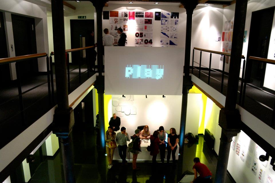
to try and bring about some sense of community spirit in Manchester. However months on it can still be seen all around Manchester, and doesn't show how original Manchester could, and should be.

So, the designers at Creative Lynx thought it would be good to get some discussion going about what could be proposed
to the council instead. Last week, Me, Bekki and Lisa worked on a number of solutions, which were then shown in
the exhibition!


Base 3 Exhibition

 This week has been rather hectic! I've been involved in setting up our third year exhibition 'Base 3' at the gallery
space at Creative Lynx, 52 Princess St. It was a big success, a pretty good turnout, and I got to speak to some people
from industry too.


Photos by Charlotte Wakefield

Buy Nothing Day - Creative Times logo brief

A few weeks back I was lucky enough to be chosen to take part in the Creative Times student brief series. Some of my existing work was showcased on the site (here), and I was then given a brief to respond to, to design a logo for anti-consumerist 'Buy Nothing Day'. The work will be on the site shortly!


Tuesday 14 February 2012

Movie titles

These movie titles originally came from a project where our starting point was the word 'Bang!'
I created this broken up type in investigations into fragile type, and thought it would work well in a moving image, where the parts of the type can start of illegible before moving together to form legible words. The fast paced, city life of the film Wall Street allows my typography to move through the streets of New York as well as hinting at the flashing, changing numbers of stock market boards.


'Fragile' Font


Wall Street - Accompanying film poster


Wall Street - Movie titles


'Wall Street Titles' by Laura Stanworth from SEVN on Vimeo.
(Music by Nickelback)

Sunday 5 February 2012

The Typographical Land of Futura

On April Fools Day 1977, The Guardian included a supplement which told of a made up island named San Serrife, a spoof which included many typographical terms.

During my research for ISTD brief 'It happened on this day' I came across this story, and with this being a typographical brief, I decided to create my own typographical land on the Planet of Futura...


Pages from my book


 My A1 Map


Saturday 4 February 2012

Tree Museum

For this competition brief we had to create the branding and launch campaign for a museum of trees! Set in the centre of London, 'The London Branch' brings the fun and nature of the countryside into the city. I have created the brand guidelines, plus some print materials, including stationery, a guide map and a billboard campaign.


Campaign


Stationery


Typography Workshop

I created this piece in a quick afternoon workshop, where we had to interpret a
sentence typographically.


Construction

I made this typographical piece in response to go into our magazine, in response to the theme of construction. It references a snap off part model kit and the method of taking apart separate components and constructing something new.


Sevn - The 3rd year Magazine

This is the first issue of Sevn, our course's magazine showcasing what is going on in Third year Graphics at MMU. As the first group of seven people, we came up with the name and concept for the magazine, obviously based on the fact their are seven people in each group and hopefully seven editions! Our theme for this issue is construction, as we are constructing the premise for this magazine and we are surrounded daily by construction works in uni. If you want to take a look at the full magazine plus other issues, have a browse here.

Front cover.
I designed this logo which picks out the VII for seven. This was planned to be printed in a
spot varnish with bronze highlights.