Wednesday 18 May 2011

Rise of the Apes brief

In line with their new film to come out this autumn, Rise of the Apes (prequel to Planet of the Apes), 20th Century Fox released a brief which asked designers to promote the upcoming movie. My short teaser animations could be sent around the web, shown on websites or on television, and centre around the idea of 'warning' the public via public service announcements that 'The Apes are Coming'. However the animations are in a way quite lighthearted, as whilst using warning signs, and trying to show an element of panic, they reference to the usual things we see monkeys doing - such as jumping on our cars at a safari park, the ape in the Donkey Kong game, or even references to King Kong. Unfortunately I never entered my work, as I still wanted to make some changes after feedback which was then too late for the deadline.

Here are the animations storyboarded...


Tuesday 17 May 2011

FLUX magazine project

We were given a few of the features for the upcoming Flux magazine to experiment with for magazine spreads. For once, I wanted to try be a bit more hands on for this project - it's been a while since I've got off the computer! So I tried out some things with creating my own type, and type within images. I'm not going to lie, I still used the computer for some bits, but at least the aesthetic is a bit of a change for me! I'm also going to try and get into photography a bit more, so I tried a couple of fashion shoots - one just a fashion editorial, and another a Pina Bausch inspired dance/fashion shoot. I think there's still a lot that could be worked on - wish I'd given myself more time too, but I enjoyed the change and the challenge, and think some of my pieces give interesting results!


Fashion Designer ANN DEMEULEMEESTER


Composer PHILIP GLASS


Film Director FEDERICO FELLINI


Choreographer PINA BAUSCH - Here, the mud letters are based on her dance piece, Rite of Spring, performed on a stage covered in dirt.


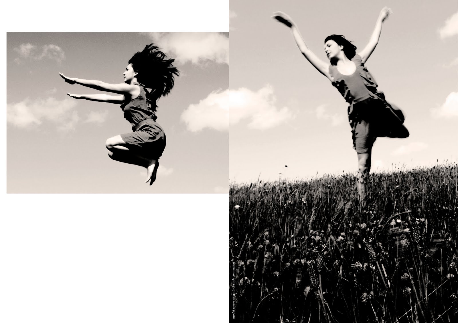
Pina Inspired shoot.


Fashion Editorial


Identity Workshop - 'Fresh' Sandwich Shop

In this workshop I was given the task of creating an identity for Laura Jackson's fantasy company - a sandwich shop named 'Fresh'. The main theme of stripes - suggesting layers in a sandwich - which can be seen on the knife in the logo, is continued in promotional items, such as give out post it note stacks that say 'Don't forget to eat at fresh', or stackable napkins, and use of stripy knives instore.


Me in the prospectus

I've recently received this photo from my university, which is to be used in our undergraduate prospectus! Last August I undertook a placement at Cube 3 Marketing in Bolton, who are now situated in Manchester. And so a while back uni came to take a photo and ask me about my time there.

My placement was also featured on Creative Boom Magazine's blog here.
I would love to go back there this summer too so fingers crossed!


Ian Anderson Workshop

The two Ian Anderson workshops of this term have been great experiences - extremely challenging and exhausting but totally worthwhile, and full of learning experiences, in particular presentation skills.

In the first workshop we had a few hours to create a self portrait of ourselves as a designer, and then  the following day had to create a logo for the person next to us taking influence from their self portrait, and then present this to the group. Emma had chosen Francium, due to its reactive properties, conveying how she reacts well to new people and experiences. My identity is primarily for use as an online website home page, the idea being that as someone rolls over it, the logo would 'react'. The 'bonds' would break and reform, flickering through different positions, and the word creative also reforms to spell out reactive. Here I have storyboarded it as an idea, (left column) and also created business cards for Emma.


Renaming Ian Anderson

A while back, designer Ian Anderson (Designers Republic) set us a brief to rename him, and create an A1 poster explaining why. He then picked some of us to participate in a workshop which I was lucky enough to be chosen for! During my research on him, I found there were a lot more google results for lead flute player of Jethro Tull, also named Ian Anderson, as well as a few others with the same name. As Ian Anderson's design work stands out so much, I decided that his name should not result in any of these 'mix ups' and decided to announce a 'big name mix up' where the letters of Ian's named were mixed up to form his new name. And I was also hoping he would find my modified image of him playing the flute instead of Jethro Tull rather amusing!


Back to blogging

We've all been so busy getting our work completed for assessment that it's been a while since I've posted any work! So thought I'd get my blog back up to date.. watch out for lots of posts to come..